Colour Confusion? RGB and CMYK explained
I know you have heard it before: “Is this brochure going to be full colour?” or “We cannot print this file unless it is converted from RGB to CMYK”. Have you wondered what these all mean? Possibly not. After all, as graphic designers and printers, it is our job, right? True. But having a clearer understanding of colour processes can help you better understand the abilities and limitations of colour and why your corporate colours don’t always look the same from your website to your business cards to your brochures.
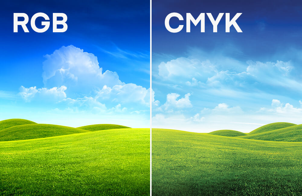
CMYK
Meaning: A subtractive colour process (you decrease colour intensity to get white) using four colours (Cyan, Magenta, Yellow and blacK).
When C, M and Y are mixed together at their full strength, the result is a dark brown. In order to achieve a true black, a fourth colour (K) is added, greatly increasing the colour spectrum. CMYK (or full colour) is the most common form of colour printing.
RGB
Meaning: An additive colour process (you increase colour intensity to get white) where three colours of light (Red, Green and Blue) are mixed together in various combination to produce millions of colours.
Black is the absence of colour and white is all three colours combined at their full strength. It is most often used in the digital world – video, digital cameras, computers, etc.
Conversions & spectrum sizes
Our eye can see a much wider spectrum of colour then we are able to reproduce, which is why images often look quite different in person than they do on screen or in print. The CMYK spectrum of colours is much smaller than the RGB spectrum, which can make reproducing images in print challenging at times. In order to print an image, it must be converted to CMYK. Our software can convert these RGB colours into their closest CMYK match, but this often leads to a colour shift – some more noticeable than others.
Colour shift
Neither of these colour systems are exact. They are heavily device-dependent. Just think of how easily you can adjust the colour settings on your TV or computer screen. The same RGB value can look very different depending on these settings. And with print, the colours can shift depending on the press type (offset vs. digital), the plate material, and even the humidity in the room! The only way to gain more control over how your colours will print is by using a spot colour.
Spot Colours
Spot colours (the Pantone system being the most commonly used) are used to print specific pre-mixed colours using and offset press (though some digital presses can now use Pantone colours). Colours are selected using a swatch book (similar to paint chips). Spot colours are often used in stationery packages where accurate corporate colours are essential. They guarantee that the colour will be consistent from job to job. Keep in mind though, that there will still be variances in colour depending on paper finish and colour.
Do you need printing services?

Discover what Cyan can do for you
We want to get to know you better so we can understand what services are going to help you meet your goals.