The Psychology of Colour in Branding: How Visual Identity Drives Emotion and Decision-Making
Have you ever wondered why you feel a sudden sense of calm when walking into a bank with deep blue accents, or why you feel a rush of hunger when you spot a bright red fast-food sign? This isn’t a coincidence. It is the result of the strategic use of the psychology of colour in branding. Branding is far more than just a pretty logo or a catchy slogan; it is an intricate dance of sensory inputs designed to trigger specific neurological responses. For marketing professionals and business owners, understanding how colour influences the human brain is the secret to building a brand that doesn’t just look good but actually performs.
Colour is often the first thing a consumer notices about a brand. In fact, research suggests that people make a subconscious judgement about a product or environment within 90 seconds of initial viewing, and up to 90% of that assessment is based on colour alone. Because our brains process visuals much faster than text, your choice of palette sets the stage for every interaction a customer has with your organization. Whether you are a small business owner, a non-profit leader, or a communications manager, mastering the psychology of colour in branding allows you to communicate your values without saying a single word.
The Science of Sight: How Our Brains Interpret Colour
To understand why colour matters, we must first look at how our biology handles visual stimuli. When light hits an object, it reflects a specific wavelength that our eyes perceive as colour. These signals travel to the hypothalamus in the brain, which governs our hormones and endocrine system. This means that colour literally creates a physical and chemical reaction within us.
The psychology of colour in branding leans heavily on these biological triggers. For example, warm colours like orange and red have longer wavelengths, which require more energy for the eye to process. This creates a stimulatory effect, increasing heart rate and appetite. Conversely, cool colours like blue and green have shorter wavelengths and are easier for the eye to focus on, leading to a cooling, calming effect on the nervous system. By selecting specific hues, brands can effectively “prime“ a customer’s mood before they even read a line of copy.
Emotional Blueprints: The Meanings Behind Common Colours
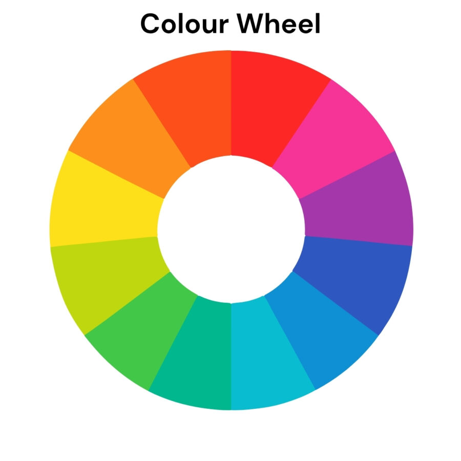
While personal experiences can influence how we feel about certain shades, there are universal emotional associations that most people share. Strategic brand managers use these associations to align their visual identity with their core mission.
For example, many financial institutions and healthcare providers use blue in their primary brand palettes. When perceived, blue lowers your heart rate and evokes feelings of calm and peace, which are key feelings for building an emotional base that represents stability and reliability.
Quick Guide to Brand Colour Associations
To help you choose the right direction, consider these common industry pairings:
- Red: Evokes excitement and urgency. This is best suited for fast food, clearance sales, and high-energy tech startups.
- Orange: Portrays warmth and friendliness. This is a great colour for brands looking for an energetic and approachable look.
- Yellow: Visualisation of optimism and positivity. This is a great colour to make elements stand out, but using it too much can quickly have the opposite effect it’s supposed to have.
- Green: Promotes peace and growth. It is ideal for organic products, environmental organizations, and wellness brands.
- Blue: Inspires trust and wisdom. This is the gold standard for banking, law firms, and healthcare providers.
- Purple: Suggests luxury and mystery. It is a top choice for high-end beauty products and creative agencies.
- Black: Signifies sophistication and power. It is most effective for high-end fashion and luxury vehicle manufacturers.
- Pro tip: Avoid using #000000 for black in digital applications, as it becomes too harsh on readers’ eyes.
Impacting Perception, Trust, and Purchasing Behaviour
The ultimate goal of any marketing strategy is to influence behaviour. The psychology of colour in branding plays a massive role in whether a customer decides to click “buy“ or move on to a competitor. Consistent use of colour increases brand recognition by up to 80%, which is a vital metric for building consumer confidence.
When a brand’s colour palette matches its stated values, it creates a sense of “perceived appropriateness.“ For instance, if a rugged outdoor gear company used hot pink as its primary colour, consumers might feel a sense of cognitive dissonance. This misalignment breeds distrust. However, when the visual identity feels “right“ for the industry, consumers are more likely to perceive the brand as professional and authentic.
Furthermore, colour can overcome language barriers. Even if a customer cannot read your website’s text, the “vibe“ created by your palette tells them if you are a high-end luxury provider or a budget-friendly local service. This immediate communication is essential in today’s fast-paced digital economy, where attention spans are measured in milliseconds.
Cultural and Regional Nuances
While biological responses to colour are fairly consistent, cultural interpretations can vary significantly. This is a critical consideration for Canadian organizations operating in a global or multicultural market. The psychology of colour in branding must account for these regional differences to avoid unintended negative associations.
When developing a brand identity, always research your specific target demographics. A palette that works perfectly in Toronto might require adjustments if you are launching a campaign in Mumbai or Tokyo.
Brand Differentiation and Channel Consistency
In a crowded marketplace, standing out is a survival necessity. One of the most effective ways to use the psychology of colour in branding is to choose a “signature“ colour that your competitors avoid. Think of the “Big Three“ telecommunications companies in Canada: one is red, one is blue, and one is green. This clear separation helps consumers identify their provider at a glance from across a busy street.
Once you have selected your palette, consistency is the next hurdle. Your brand colours must look the same on a smartphone screen, a printed brochure, and a roadside billboard. This requires strict brand guidelines that define your colours in HEX, RGB, and CMYK formats. Inconsistent colours suggest a lack of attention to detail, which can subtly erode the trust you have worked so hard to build.
Practical Tips for Selecting and Testing Your Palette
Choosing a brand palette shouldn’t be based on the CEO’s favourite colour. Instead, it should be a data-driven process. Here are some practical steps to help you find the right fit:
- Define Your Brand Personality: Before looking at swatches, write down five adjectives that describe your organization. Are you “playful“ or “serious“? “Modern“ or “traditional“?
- Analyze Your Competition: Map out the colours your competitors use. Is there a “gap“ in the market where a new colour could help you stand out?
- Use the 60-30-10 Rule: Choose a primary colour (60%), a secondary colour (30%), and an accent colour (10%). This creates visual balance and hierarchy.
- Test for Accessibility: Ensure your colour choices have enough contrast for users with visual impairments. Tools like the Web Content Accessibility Guidelines (WCAG) testers are invaluable here.
- Gather Feedback: Show your palette to a small focus group from your target audience. Ask them what emotions the colours evoke without telling them your brand’s mission first.
FAQ: Common Questions About Colour Psychology
Does the psychology of colour in branding actually work for B2B companies? Absolutely. While B2C branding often focuses on impulse and emotion, B2B branding uses colour to signal professional expertise and industry stability. Blue and grey are staples in B2B because they communicate maturity and logic.
How often should I update my brand colours? Your core brand colours should be evergreen. However, you can introduce “seasonal“ or “campaign-specific“ accent colours to keep your visual identity feeling fresh without losing your established brand equity.
What if my favourite colour doesn’t match my brand’s mission? In professional branding, your audience’s perception always takes precedence over personal preference. It is better to have a successful brand in a colour you dislike than a struggling brand in your favourite hue.
Can a brand have too many colours? Yes. A cluttered palette can confuse the brain and dilute your message. Most iconic brands stick to two or three primary colours to ensure maximum recall.
Elevate Your Visual Identity with Cyan Solutions
Is your current brand palette doing the heavy lifting it should? Or is it sending the wrong message to your prospective clients? In an era where visual communication is more important than ever, your colour choices are a fundamental pillar of your success. The psychology of colour in branding is a complex field, but you don’t have to navigate it alone.
At Cyan Solutions, we specialize in helping organizations align their visual identity with their deepest values. Whether you are a non-profit looking to inspire donors or a business aiming to dominate your local market, our team can help. We offer comprehensive branding audits to review your current assets, refine your existing look, or build a cohesive colour palette and brand guidelines from the ground up.
Don’t leave your first impression to chance. Connect with us today for a branding consultation, and let’s build a visual identity that resonates, inspires trust, and drives results.
Want to make your marketing decisions data-driven?
Talk to the marketing experts at Cyan today. Contact Us.

Discover what Cyan can do for you
We want to get to know you better so we can understand what services are going to help you meet your goals.