Overview
Who
Asign - SLIAO
What
- Renaming
- Illustration
- Digital Marketing
- Print Marketing
- Website Development
- Branding
- Logos and Corporate Identities
- Graphic Design
- Website Planning
- Website Design
- Printing
- Promotional Products
- Video
- Social Media
- Trade Show Displays
- Advertising
Challenge
The primary challenge in rebranding SLIAO into Asign was to create a cohesive and modern brand identity that resonated with both existing and new audiences. This required a balance of preserving the original brand’s values while introducing fresh elements to enhance accessibility and inclusivity. The project spanned various phases of branding, marketing, consulting, design and development; contributing to efficient collaboration and communication with all people involved.
Target
The rebranding initiative targeted both existing stakeholders and potential new audiences by focusing on inclusivity and modern appeal. The goal was to reshape the perception of the organization, enhancing its relevance in a diverse marketplace. By integrating accessibility as a core element of the brand’s identity, the project aimed to broaden its reach and increase engagement across various demographics. The new brand identity was designed to be universally welcoming, ensuring that it resonates with a broad spectrum of individuals and organizations who value inclusivity and contemporary brand aesthetics.
Solutions
Renaming and Rebranding
SLIAO’s rebranding into “Asign” emphasized innovative solutions that enhanced both aesthetic appeal and functional usability. Central to this transformation was the development of a cohesive brand strategy that married the organization’s core values with its new identity. To achieve this, the Cyan Solutions team employed a multi-faceted approach:
Comprehensive Market Analysis: Conducting detailed research to understand the dynamics of the target markets facilitated informed decision-making, ensuring that every change aligned with market expectations and trends, and respected the history and challenges of diverse communities, specifically those within the deaf community.
Advanced Design Techniques: Utilizing cutting-edge design tools and methodologies, the team created a compelling visual identity that resonated across different platforms, leveraging clear visual cues and universal symbols to ensure accessibility and inclusivity for the deaf community.
Enhanced Accessibility Features: Incorporating universally accessible web design principles, the website revamp focused on ease of navigation, readjusting layouts, and adapting features such as captions and sign language videos to cater to users with diverse needs, thereby expanding the brand’s reach and ensuring everyone can engage with content seamlessly.
Cross-functional Collaboration: Encouraging seamless teamwork across departments ensured that timelines were adhered to and that solutions were developed in alignment with overall strategic objectives. Input from experts in accessibility for the deaf community was integral to tailoring the brand’s approach and guaranteeing inclusivity.
These solutions not only revitalized the brand’s image but also helped refocus internally, fostering a renewed sense of purpose and alignment within the organization. This internal shift reinforced the brand’s commitment to inclusivity and modernity, acknowledging and addressing the unique challenges faced by the deaf community while preparing it for sustained growth and wider acceptance in a competitive landscape.
The Rebranding Process
Understanding the Needs
The team at Cyan Solutions took the time to understand the history, challenges, and appropriate terminologies within the deaf community. This in-depth understanding was crucial for crafting a brand that would resonate well beyond Ottawa.
Implementation
Phase 1: Renaming and Logo Development
Phase 2: Website Development
Phase 3: Brand Guidelines and Assets
Phase 4: Communication and Rollout
Phase 5: Ongoing Brand Evolution
Logo Update
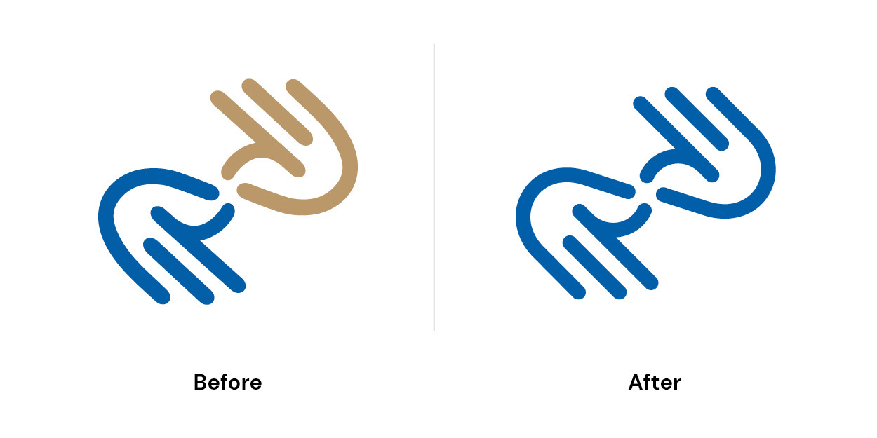
Once the new name was established, the next step was to refresh the logo and colour palette while keeping the recognizable hands identifier from the original SLIAO logo. This ensured a smooth transition and maintained brand recognition.
Logo Reveal Video
To communicate and promote the new name to their team and clients, we produced a logo reveal announcement video. In the new name reveal video, each keyword represents a core value or aspiration tied to the deaf and hard-of-hearing community, capturing Asign’s commitment to inclusivity and accessibility:
a sign of change: Signifies a new chapter in communication access, where the needs and voices of the deaf and hard of hearing are at the forefront of progress.
a sign of connection: Represents bridging the gap between hearing and non-hearing individuals, fostering connections and mutual understanding in every interaction.
a sign of communication: Highlights Asign’s mission to facilitate clear, accessible communication, ensuring that everyone can participate fully in conversations and exchanges.
a sign of language: Celebrates sign language as a rich, expressive means of communication, acknowledging its cultural significance within the deaf community.
a sign of accessibility: Emphasizes a world where accessibility is not an afterthought but a given, ensuring equal opportunities for those with hearing differences.
a sign of opportunity: Reflects the belief that everyone deserves the same access to education, work, and social experiences, creating pathways for the deaf and hard-of-hearing community.
a sign of evolution: Signals Asign’s dedication to continuous growth and adaptation, using innovation to enhance communication tools and resources for the community.
Each phrase builds on Asign’s vision of a world where the deaf and hard-of-hearing community feels seen, valued, and empowered to communicate freely. When the words “a sign” merge to form the name Asign and the new logo appears, it stands as a symbol of this inclusive mission.

Services Identifiers
In rebranding SLIAO and expanding its reach, Cyan Solutions aimed to create a cohesive identity that captured the heart of each service. During the development process, the team designed three unique identifiers for each line of service, each with its own story:
Video Remote Interpreting: This identifier highlights how technology bridges communication between deaf and hearing individuals, allowing for connection regardless of location. By integrating remote access, it symbolized breaking down physical barriers to understanding.
In-Person Interpreting: This service identifier emphasizes the power of face-to-face interactions, promoting empowered communication and building meaningful relationships through precise, in-the-moment interpretation.
Sign Language Translation: This symbol is dedicated to the importance of accessible information, ensuring that the deaf community has equal access to resources and knowledge. It reflects the brand’s commitment to inclusivity, showcasing that everyone deserves access to information.
These identifiers became more than symbols, they encapsulated Asign’s core mission to serve the deaf community in Canada and beyond, making communication truly accessible in all forms.
Website
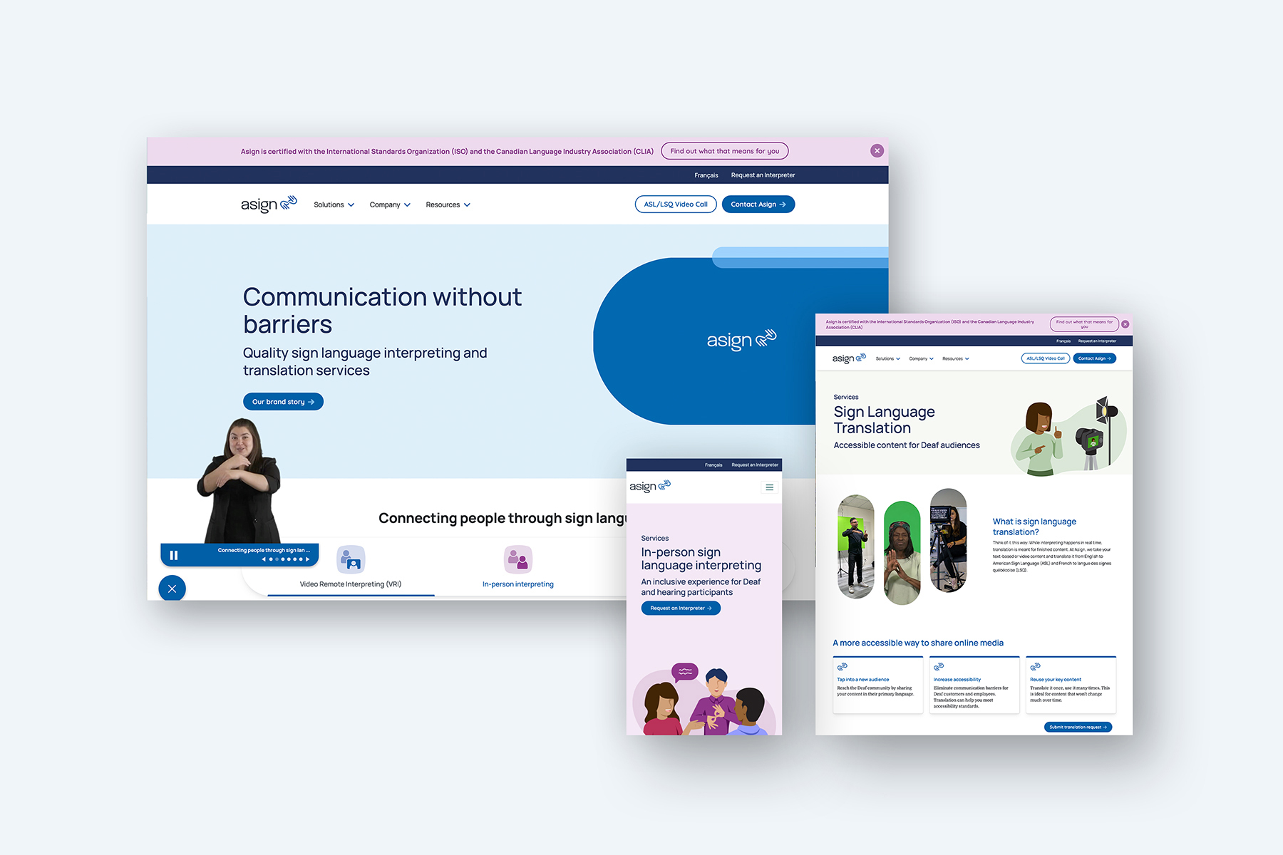
Cyan Solutions planned, designed and built a fully optimized and functional website for Asign, featuring custom integrations that streamline user experience and content management. A modular design approach was implemented, providing Asign with flexible, customizable content sections allowing easy updates and scalability.
Unique to Asign’s website is the ability to attach sign language translation videos to each of their page sections; maintaining the same ease of editing and flexibility of their content. This video element remains sticky on the page and follows you down the page so an ASL or LSQ video is always available to website users.
CRM integration with HubSpot was seamlessly incorporated, ensuring that leads and user interactions are tracked and organized for effective follow-up. Cyan also managed essential redirects to preserve SEO value from previous pages, and a new analytics setup was configured to capture detailed insights on site performance and user behaviour. Together, these enhancements enable Asign to maintain a responsive, data-driven website that supports its growth and outreach goals.
CRM setup and optimization
As part of the CRM setup and optimization on the new Asign website, Cyan Solutions integrated key HubSpot functionalities to streamline lead management and enhance user engagement. Cyan set up tailored properties and forms to capture relevant visitor information, ensuring a seamless experience for users while enabling efficient data collection. Additionally, the HubSpot tracking code was embedded across the site, allowing Asign to monitor visitor interactions, gather insights, and personalize follow-ups. This integration not only optimizes Asign’s CRM capabilities but also supports data-driven growth and fosters deeper connections with the deaf and hard-of-hearing community.
Brand Guidelines
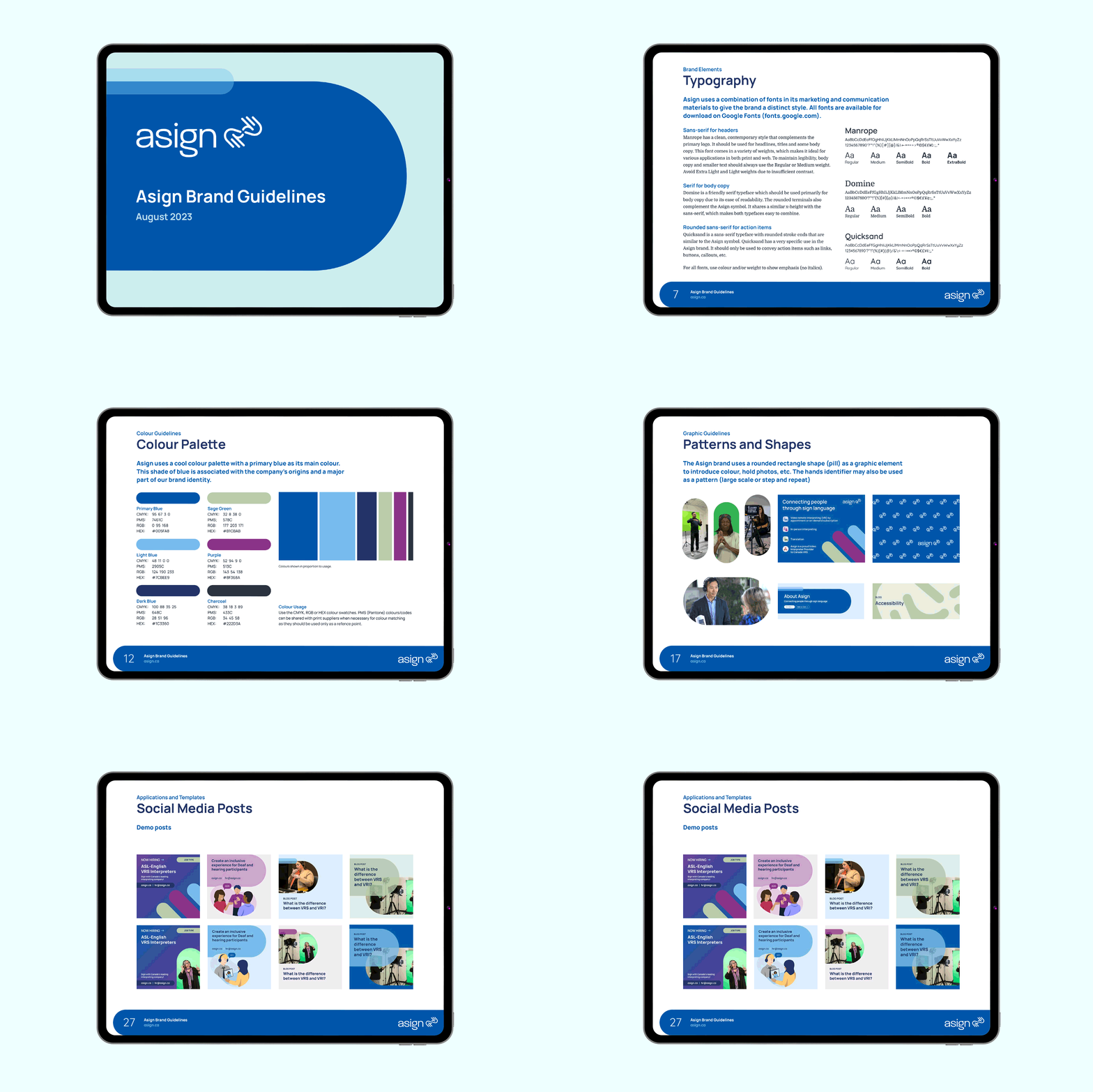
Cyan Solutions developed comprehensive brand guidelines for Asign to ensure consistency and clarity across all communications. The guidelines included detailed specifications on logo variations and usage, ensuring the logo maintains impact in any context. A carefully selected typography set was chosen to support accessibility and readability. Cyan also created customizable Canva templates for social media posts, enabling Asign to easily maintain brand alignment. Additionally, the guidelines featured unique patterns and shapes that reinforce the brand’s identity and a cohesive colour palette that reflects Asign’s modern, inclusive approach. Together, these elements provide Asign with a strong visual foundation that resonates with its mission.
Printed and Promotional Items
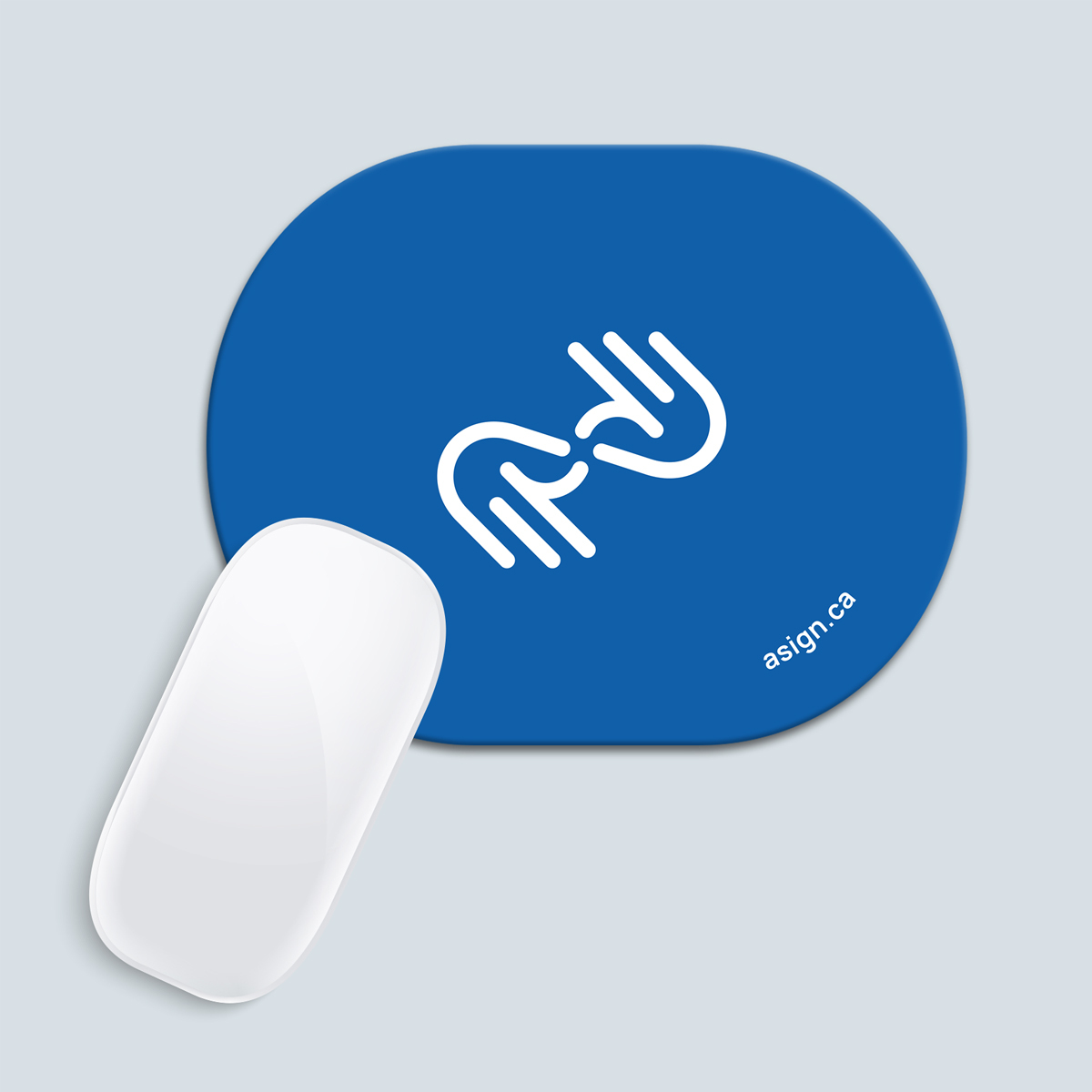
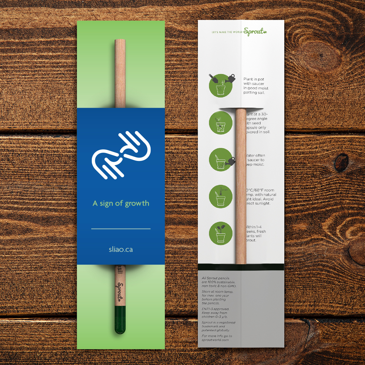
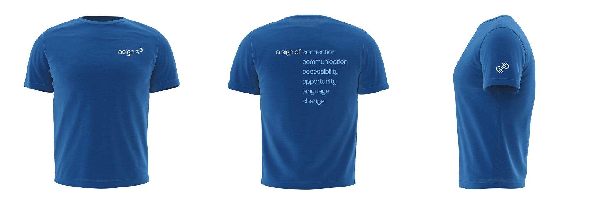
We produced a suite of printed materials and apparel to go along with the name and branding.
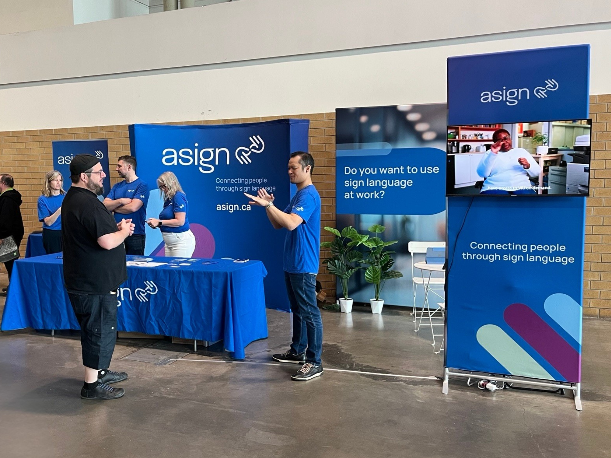
Trade Show Displays and Signage
We designed and produced new trade show displays (backdrop, podium, banners) as well as outdoor signage for their main office building in Ottawa.
Brand, Social Media, and Video Templates
For Asign’s Brand, Social Media, and Video Templates, Cyan Solutions developed an extensive suite of resources to streamline content creation. Word and PowerPoint templates were developed for ongoing presentations and files. Canva templates were designed for social media, making it easy for the Asign team to create consistent, branded posts with a professional look. For video content, Adobe Premiere templates were built using After Effects, allowing Asign to produce engaging, high-quality videos that align with brand guidelines. These templates enable quick customization while preserving Asign’s visual identity, empowering the team to share impactful stories and updates that resonate with the deaf and hard-of-hearing community.
Icons and Illustrations
Cyan Solutions crafted customized icons and illustrations uniquely tailored for Asign. Each icon was designed to represent specific scenarios relevant to the deaf and hard-of-hearing community, such as accessibility, communication, and inclusion, enhancing clarity and connection within the brand’s messaging. Cyan also incorporated elements of diversity into the illustrations, reflecting varied backgrounds, ages, and abilities to resonate with Asign’s inclusive mission. This customization brought a personalized touch to the visual identity, ensuring that every icon and illustration not only aligns with Asign’s brand but also authentically represents the community it serves.
Results
The comprehensive overhaul executed by Cyan Solutions was grounded in careful strategy and innovation, with a particular emphasis on inclusivity, particularly for the deaf community. Historically, the deaf community has faced numerous challenges, including communication barriers and a lack of representation in media and design. Cyan Solutions recognized these issues and prioritized the use of appropriate terms and culturally sensitive language when addressing this community. By integrating rigorous market analysis, the team ensured their changes not only aligned with current industry trends but also adhered to best practices in dialogue with the deaf community.
Accessible design practices were adopted to craft a visually cohesive identity across platforms, incorporating elements such as clear iconography and captions. Furthermore, a strong emphasis was placed on accessibility, enhancing usability for a broader audience, including users who communicate primarily in sign language or rely on visual cues. Streamlined communication strengthened brand engagement, while cross-functional collaboration guaranteed efficiency and strategy coherence. This multi-pronged approach not only rejuvenated the brand’s image but also established a robust foundation for future growth and competitiveness, with a respectful nod towards historically underrepresented groups.
For marketing professionals, brand consultants, and business owners looking to undertake a rebranding effort, this case study offers valuable insights into the process and the strategies that can lead to success.
Interested in how we can help your brand evolve? Contact us to discuss your next big project.
“Cyan was really helpful throughout the whole process. So one of my favorite things with Cyan is that it feels everything they do is really intentional and thoughtful. It felt like they asked a lot of thoughtful questions from the get-go. They took the time to research and get to know us and get to know our services and our target audiences and what we’re all about. They really cared to learn about our marketing strategy and just our objectives with the rebrand.”
Discover what Cyan can do for you
We want to get to know you better so we can understand what services are going to help you meet your goals.
